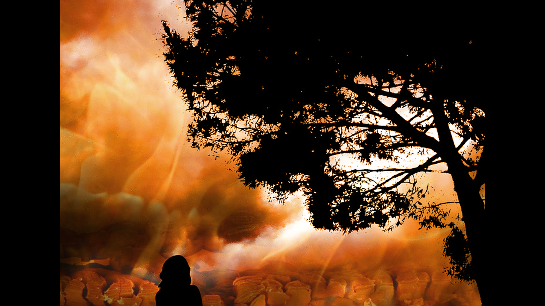
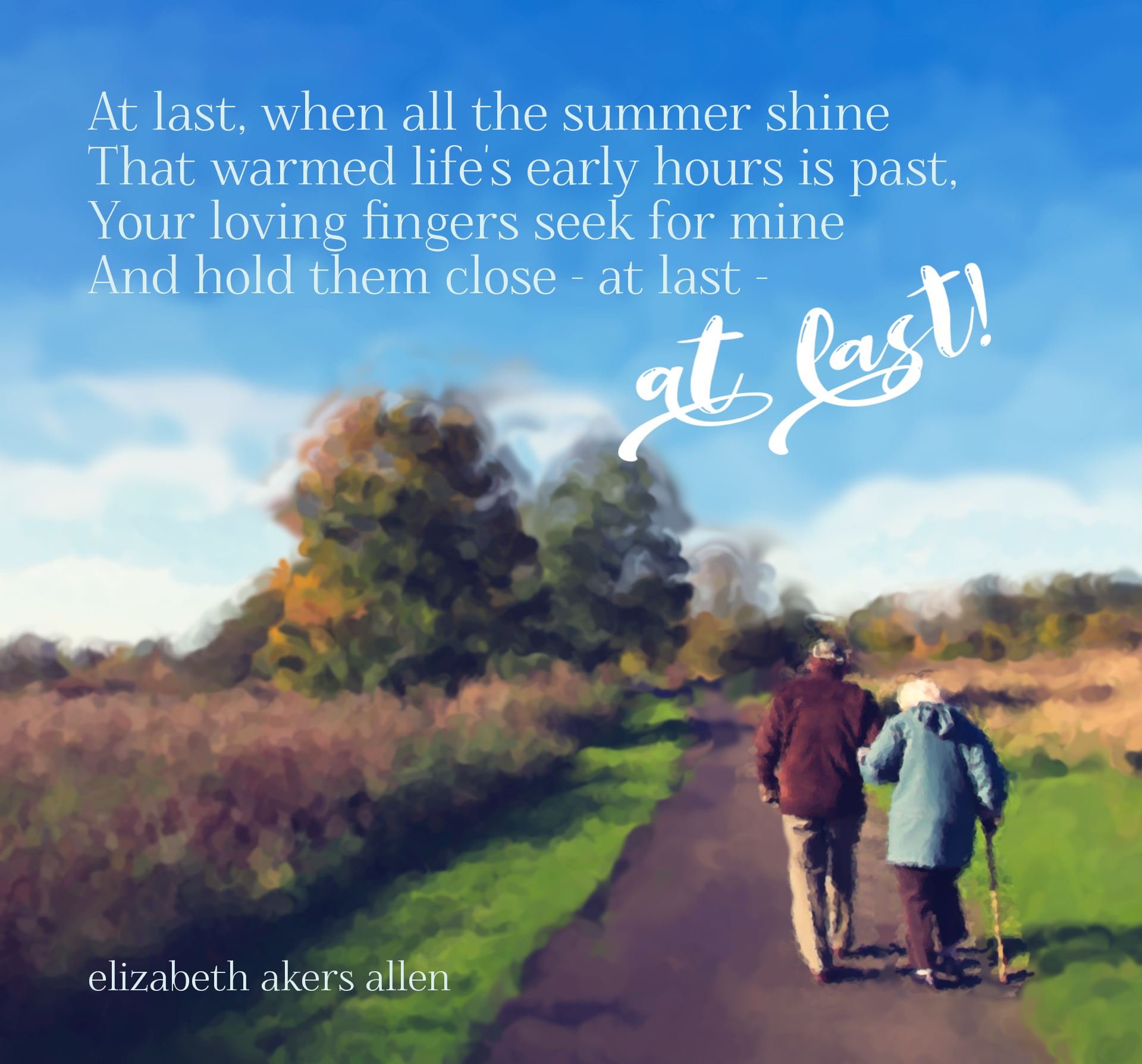
Revised Exhibit
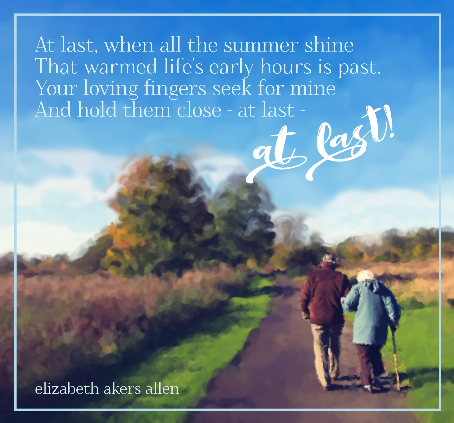
Original Exhibit
Background
I really enjoyed learning about history brushes this week, and I was particularly taken with the art history brush and being able to play with painting-type effects on an image. I also have been thinking about my grandparents this week and missing them, so I decided to develop an image in tribute to them.
Photoshop Skills
- Adjusted image color, saturation, vibrancy, and noise in Camera Raw
- Used the art history brush in various sizes to transform the photo into an impressionist image
- Changed brush sizes in order to draw attention and give clarity to the two walking figures
- Added the text and reduced leading to increase sense of proximity
- Turned the final words of the poem into a smart object and applied slight warping to increase handwritten effect
Design Skills
- Left alignment of poetry lines and author attribution to draw visual connection between the words and the author
- Contrasting fonts (serif and script fonts) to emphasize the second "at last" in the poem.
- Minimally contrasting colors for font to have some slight differences between the main body of the poem and the emphasized words in the script font. This allows the "at last" to stand out further, beyond just the change in font.
- Repetition of font from poem and author's name. In addition to the alignment of these lines, the repeated font also links the words to the author.
- Applied rule of thirds in slightly cropping image. I decided to crop this as a square. The original image was almost square, but I adjusted the crop to have the figures in the lower-right region of the 3x3 grid.
Credits
- Image by coombesy via Pixabay
- Foglihten font from dafont.com
- Birama font from dafont.com
Revision
I generally like the way this exhibit turned out. My instructor suggested removing the box on the edge of the image. I actually like the image either way, so I decided to include the updated image as well as the original one with the frame.