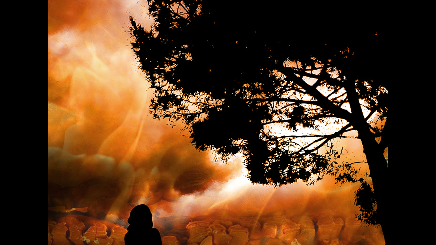
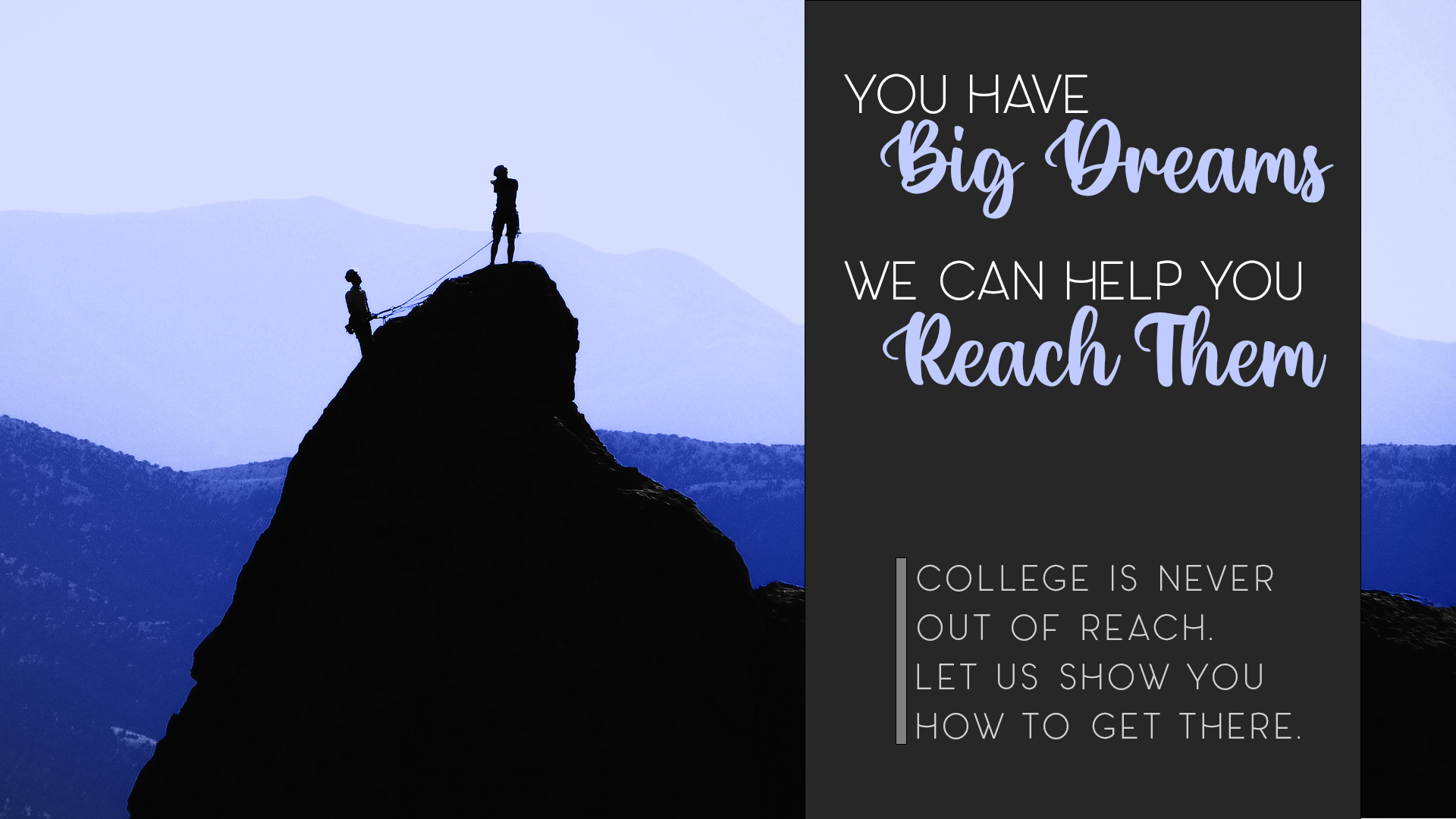
Revised Exhibit
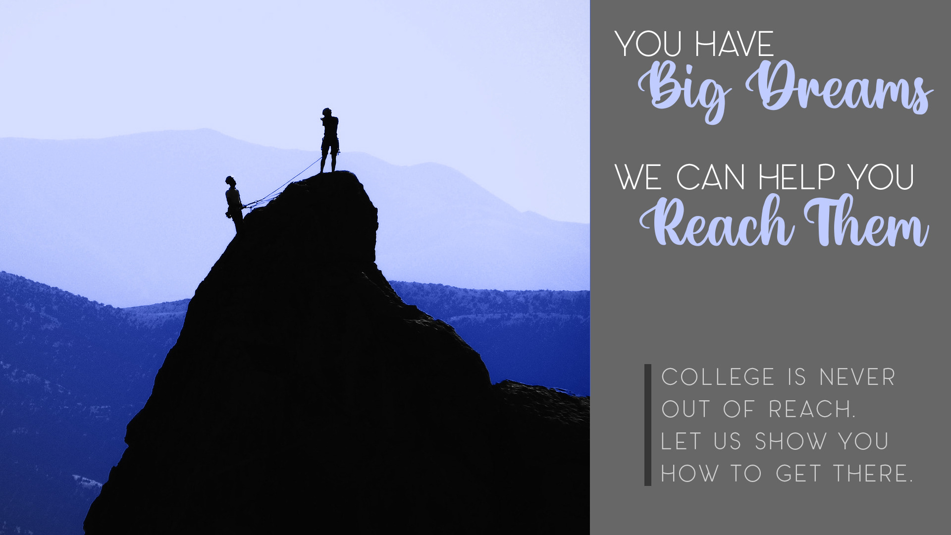
Original Exhibit
Background
In creating this display, I wanted to underscore the hard work that it takes for individuals to go to college. I also wanted to emphasize that no one is alone as they work toward their college goals. The Stars/Gear Up program offers resources and support to students striving to reach their college dreams. I hope the images and text can inspire students to keep working toward their goals.
Photoshop Skills
I started with a black and white image of two climbers ascending a mountaintop. I left the foreground (the silhouette of the mountain and climbers) black and white, then colored the background in a more vivid blue to connect to the colors of USU. I applied the following Photoshop skills:
Selection to separate the background from the foreground in the image.
Masking to refine selection and prepare for coloring.
Working in layers to position and arrange various elements.
Coloring a black and white photograph.
Using Photoshop brushes
Design Skills
I worked to include the following design principles in this exhibit:
Contrast | I used a script/handwriting font alongside a sans serif, all caps font for contrast.
Repetition | I repeated the color of the most distant mountain range in the type of the script text. I also created a sense of repetition through the way I styled the fonts and which text I had in which font. I repeated the script font in order to highlight and emphasize the idea of reaching dreams.
Alignment | I chose a left alignment for the text, with slight variation; the first and third lines are justified left, and then the second and fourth lines are slightly indented but in alignment with each other. Finally, the vertical line that sets off the text at the bottom is aligned with the script text.
Proximity | I created a sense of proximity by reducing the leading for the first two groups of text. These two groups are also more proximate to each other than they are to the text at the bottom, which is separated with more white space.
Typography | I chose two fonts that provided contrast and allowed for emphasis on what I identified as the most important ideas: dreaming and reaching.
Credits
I found the image on Pixabay. I downloaded two fonts from the internet: Panama, from The Hungry JPEG; and Hello Valentica from DaFont.
Revision
After reviewing feedback from my instructor and peers, I decided to revise this exhibit. I clipped part of the image and moved it to the right of the text box, thereby giving a sense that the image extends behind the text. I also deepened the color of the text box in order to enhance contrast. I think the overall effect of the revised image is stronger in the revised version.